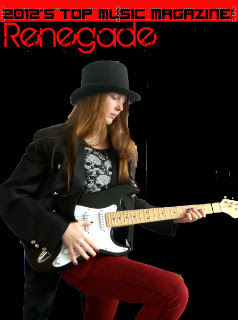
Thursday 20 December 2012

Initial draft feedback

Here is my first draft for my music magazine, which had been given feedback by a number of students. I presented my work to them, and the following is what was said about it:

Student One:

  • "Good range of coverlines."
  • "Model posture looks boring as if it has been set up."
  • "Can't clearly tell the genre of the magazine."
  • "Like the title font- it's interesting."
  • "Good use of colour. Mix of three."
  • "Maybe use some different size text to others?"
  • "Get a photo of the model looking at you."
Of this feedback, I think the points about my cover model, as it could look a little more interesting/indicative of a music magazine. The point i disagree with most is probably the different sized texts, as I have used different size text for the artist's name, the coverlines, the featured artists and the price, date and issue number. 

Student Two:
  • "Picture representative of genre."
  • "Picture may blend into the background a bit."
  •  "Maybe one more coverline."
  •  "Maybe add some design-y elements"
  • "Maybe a bit boring."
Of this feedback, I agree with the point of the need for "design-y" elements, or things that make my magazine differ from that of the others currently for sale on the market. I may add an additional coverline as well, however, I personally think 4 is enough, as my magazine analysis of Kerrang! only has 4-5 coverlines.

Student Three:

  • "Look at the photo-it seems to be cut and paste. It needs to blend in more with the background."
  • "Placement of coverlines needs to be rearranged."
  • "Change text size-it's all the same."
  • "Think of the name, it doesn't seem to fit with the feel of the magazine genre."
Of this feedback, I do agree with the need to blend the photograph more with the image, and I also agree that I may need to rearrange my coverlines slightly. However, I disagree with the text all being one size, as it isn't. However, this indicates to me that a change of font may make the change appear more visible. 

Student Four: 
  • "Black background causes the photo not to stand out."
  • "Would prefer the model to look at the camera."
  • "Coverlines dominate the photo."
  • "Title and font style look good."
  • "Red does look good on the magazine."
  • "There are enough coverlines, but perhaps a bit too wordy."
  • "Change text size."
Of this feedback I agree with the point about the background. This has come from several sources, and so I shall change the background to make it lighter. I also agree that the blend of red and black look good, however, if i change the background, that might have to change too. Once again, I disagree with the text, and intend to change the fonts to rectify this confusion. 


Wednesday 19 December 2012

First Draft construction (2)

Now that I have my cover image, and title, I now have to add my coverlines to the cover, along with my 'award' section.

I wish to add some blocking behind the text for my Award, so I have to insert a filled shape first. This shall then be filled with a colour of my       choice. In this case, red.  Now all I have to add is my text.


Now I simply have to add my coverlines, which shall be done in red, to keep with the house style, and the featured artists in white, as this creates a contrast with the two colours already on the front.


For the font, I utilized Stellar Kombat: a font which my research showed would suit my style of magazine. However, My research has also shown me that the names of the artist should be slightly bigger, to make them appear more important the other text on the front cover. I shall therefore make them slightly bigger.

Next, I have to add my barcode to the cover. This also means moving the text at the bottom of the page. To get my barcode, I Made one utilizing a generator:


Now I all I have to do is copy it, and put it on my cover.

Finally, all I have left to do with the text is to enlarge my title, so it goes from side to side, and to add my date/issue number above my barcode.


As for the Issue number, date and price, I shall make this my 126th issue, the date shall be for january 2013, as this would make my award seem believable. As for price, I shall make this £2.30, as my research has shown me that this is the general asking price for a magazine like this.


Now I have decided to make the title for my cover artist much bigger, as to make sure it is the focus of attention, and so that people know it relates to the artist on the cover.


Monday 17 December 2012

Cover Line planning

I have decided that before I add my cover lines, I want to add a line above my title, speaking of the awards it has won, and or been nominated for, such as 'Best new music magazine', and 'Hottest upcoming magazine.' Before I can add this, I need to adjust the positioning, and location of my title. At the same time, I also have to decide what my cover lines should be advertising, and how they should be doing it. Firstly, I need to decide how many cover lines I shall be putting on my front cover. I have chosen to go with 4, including the one advertising the main artist of my magazine.

To begin, I have to decide what kind of awards my magazine has been nominated for, or has won.  I want these to be real awards, such as Best UK music magazine, and Most Promising new music magazine. Of the awards I have found, I have chosen to claim my magazine has won the Best UK music Magazine 2012, as the time of creation is at the end of 2012, and the start of 2013, so the award would fit the magazine. This award could have also been given my NME, so this could also feature on the cover.

Next I have to decide what I want to make up my cover lines. I have come up with several, however, of the ones I have created the ones I have chosen are as follow:

"Matt Bellamy: The price of fame."
"The Joy Formidable: In the Shadow of a Legend?"
"You, Me at Six: Making waves in the UK!"

Along with this, I also have to design the promotional piece/cover line on the artist I have on my front cover. For this, I was thinking of having a direct quote from the article on the double page spread. For this, I was thinking along the lines of:

"Bringing music back to the good ol' days!"

Thursday 13 December 2012

Front cover initial draft

As I work on the different aspects of my front cover, I shall explain each step, and each choice I have made. and what I have changed in the image. Firstly I opened up a new photoshop PSD, with the following specification:


After I had completed this, I was left with a blank, A4 sized plain PSD. I intend to put all the different elements together, over the top of this, to create my full cover.

Next I have to crop my front cover image, and place it onto my background. To do this, I shall utilize the quick select tool. With this, I can quickly highlight the sections of the picture I wish to get rid of, or in this case, remove the centre image from.  Next, after removing the background, I have to overlay the two pieces, and transform my image. This will have be decreased in size, as the background has been made on a smaller scale.


Next, I have to add my title to the work. The font I have chosen, Birth of a Hero, has to be downloaded from dafont.com. Firstly, I have to download the font, then install it. Once installed, the font can be found in photoshop.

Now I have to insert my title onto my photoshop file. I start by selecting the text tool from the toolbar.

Now I just have to select my font, and then create my text, and change the size of my font to make it visible and legible.


Now I think the image is too dark for the background, so, utilizing the curves tool under brightness and contrast, I shall make it brighter.


 Now I think the image stands out much more, and I am far happier with the result. 

Alternative rock magazine styles/conventions

When choosing/designing my photograph and front cover, I had to abide by the conventions of Alternative Rock magazines when deciding how I want to comprise my front cover. Firstly, from my research into the covers of magazines, I have discovered that Artists who have a unique/quirky style about them are always shown to be the centre of attention. With this thought in mind, I will be sure to make my main photograph the focus of the picture, ensuring that as little of it is covered as possible.

Along with this, I also intend to make my cover lines in the house style for my magazine, as to not have the problem of a messy magazine such as Kerrang! where the cover lines do not fit the magazine they are on. Therefore, I plan to have my magazine utilize a dark red, and black colour scheme, so I shall try to match the cover lines to this style.
Additionally, when comprising my front cover, I shall ensure that the cover lines take up less space than on the magazine Kerrang!, as this makes the magazine look too messy, and as though there is too much information on the page. Whilst I may utilize some of this messy style on my cover, I will attempt to limit this as the magazine would no longer be suited to it's genre, and would appear to be a more heavy rock based magazine.

Furthermore, the positioning of my title is very important to the layout of my magazine. I intend to have it at the top of my magazine, as expected. I shall also have it in-front of the rest of the magazine's content, otherwise the title could get lost behind the images. This will also help my magazine be instantly recognizable, and stand out.

Next, I have to think about the style of my model who shall be appearing on the cover of my magazine. Since I am going for a quirky/unique style for my artist, I needed to utilize a suitably unique outfit. The outfit in question is comprised of a tail-coated suit jacket, a black shirt, a pair of red trousers and a black top hat. My model's nails were also painted red and black. This is because the outfit resembled that of a magician, and since my artist needed a gimmick, I decided to mix the outfit, with photos involving playing cards.

This links back to my research, as I found that many front covers feature artists with similar gimmicks, such as the photograph on the left, in which the title of the story is linked to the cup in the photograph, which also matches the jacket worn on the cover.

Lastly, I have to ensure that my cover features a large title, giving the name of the artist on the front cover. It also has to be of a contrasting colour to that of the background. In this case, I could utilize red, to match the house style I have planned.

Front cover initial draft main image


So, after comprising my research, and taking all my photos, I have to decide on what image I wish to use for my front cover for my front cover. From the 200 + photographs I took, I have narrowed it down to a photograph which has two variations: One where the model is looking at the camera, and one where the artist is looking down at her guitar.


Personally, I prefer the photograph where she is looking down at the guitar, as the look on her face seems to fit that more than the one of her looking at the camera, so I shall use that photograph in my first draft for my front cover.

Tuesday 11 December 2012

Chosen photographs

For my front cover, my contents page, and my double page spread, I have selected a number of photographs to be edited for my work. One is clearly for the front cover, two are for the contents, one is for an 'editors message' as seen in Kerrang!, and a photograph for my double page spread.


Monday 10 December 2012

Reasoning behind front cover photos

For my photographs, I chose to dress my models up in a style which would match the genre of my magazine. Since I was going for an alternative rock magazine, I decided to go to the extremes of the genre's magazine covers: One fairly normally dressed artist, such as those seen on the cover of Kerrang!, and one dressed in a very quirky manner, like those seen on the cover of NME.

I took inspiration from Kerrang! for my first model. I dressed him up in fairly plain clothes, with a red leather jacket. This, much like the colouring I have planned for my title, and cover lines is bright, and a contrast to the plain clothes. and so should stand out from the rest of the cover. This mirrors a magazine such as Kerrang! where the main artist on the cover appears to be wearing casual clothes, such as those the artist would wear off stage. However, I have utilized the red jacket which lis my way of putting a spin on what i have already seen. The jacket also bears the 'Superman' logo across the chest, so if I featured that model, I could draw specific mention to it, and utilize it as part of the artist's character/persona.

The next model I dressed up in a more unusual outfit, comprised of a tailed suit jacket, a top hat, a cane, and a pair of casual trousers/a casual shirt. Her nails were also painted black and red to mirror the black jacket of the suit, and the red trousers she was wearing. This is because some of the artists featured in Alternative rock magazines have a very quirky/unique style, and I wanted one of my artists to be no exception to that rule. As was seen with the artist on the cover of NME, I have also chosen to utilize props, in the form of a cane, and a guitar. As the full outfit resembles some form of magician, and the outfit is primarily comprised of red and black, I have chosen to utilize a playing card gimmick for my magazine, as it matches the outfit my model was wearing. Ultimately, I prefer these photographs to those of my male model,because they seem to suit the genre of my magazine slightly better than the other ones, along with the fact that I prefer those photographs, due to the fact that they are far more varied, and there is more that can be done with them.


Saturday 8 December 2012

Magazine Cover Composition

To comprise my front cover, I shall plan out the layout for my Music Magazine. Firstly I need to decide the size of my logo based on the size of my front cover cover image. From my research, I have noted that the main image of the magazine normally takes up around three quarters of the main page. Therefore, I shall make the image to this size, even if this means editing, or removing a section of the main image. Using this size as my base, the logo shall be at least half the length of the page, and it shall be of a similar width.

The next thing I have noticed is that the main cover tends to have cover lines, which take up one side, and in the case of my magazine, it shall be down the left hand side of the page. These shall be fairly generic cover lines, such as advertisements for other artists and competitions. 

I shall also have a cover line, linking to my cover photo, to introduce the cover artist. Once again, this shall be inspired by the other magazines I have looked at, and will vocalize my artist's feeling toward stardom, and how they got where they did. This will also be reflected in my double page spread, and the story I shall create.

Next, I have to consider the positioning of my barcode, and my issue number shall go. I shall be placing them in the bottom left hand corner of the page, as not to interfere with my cover lines. I shall only have this in the bottom corner, as not to interfere with the rest of my cover.

Now, I have to decide weather or not I want to have my title over my main image, or to have it under it. I feel that I should have the title over the magazine, as the magazine is a one off, and thus the tittle wouldn't be instantly recognizable, compared to others.

Lastly, I have to decide what colour, or house style I should utilize. Due to the nature of my magazine, and the audience it is aimed at, I shall utilize a dark red, and black style, as they seem to be the colours that woulds suit my magazine.

Wednesday 5 December 2012

Front cover Fonts: Outside Source Fonts

Apart from the fonts which were pre-loaded on Photoshop, I have also been looking at outside sources, such as dafont.com. On websites such as this, you can find different categories of fonts, which can be utilized on different softwares, such as Microsoft word, and Photoshop.

To the right is the front page of dafont.com. For my magazine, I am looking for a warn effect text, and so I shall begin my search in the Eroded category.

Here is the initial 4 fonts on the page, with the top one being the most highly rated. 
The first on this list is known as Broken Type. Already, this font is far more to my liking than the others I found searching through photoshop. Whilst Broken Type font is far more to my liking than the other fonts I have cover, I shall continue searching for others, in case I find a better one.    


The next font I viewed was called Birth of a Hero. This font is practically perfect for my needs, as it has the warn look I am after, along with the rounded style of text I initially planned to have. However, I have so far only searched over the first page, so i shall conduct a further search, before making my decision, to ensure I have looked over all the font. 

The next font that I found to be to my specification is called The Maple Origins. Whilst this font possesses the square style, and the warn look, it is hollow and white, which is something I find to be not to my style/liking and therefore I don't think I shall utilize this exact font.