
Thursday, 31 January 2013
Double page spread layout research
The next step in creating my music magazine is my double page spread. Firstly, since I have already written my article, I shall focus solely on the layout of the article, and how other magazines choose to lay their pictures out.
The first Double page spread is from an Issue of Kerrang! This double page spread features a picture on one page, whilst the other is where the article is printed on the other. The text is all on one page, except there is a column of information on the side of the picture. The text inside the article varies in size, especially where the paragraphs start and end. The pull quote is also located at the very end of the article, and is enlarged. In my opinion I like this layout, as it looks simplistic, and, whilst I feel it could be improved with text wrapping, and a few more design features, I like its simplistic look, and will more than likely include some elements of this in my work.
The second double page spread is from a Rock Sound magazine. This one features the article on one page, whilst the main image is on the other.However, the article is surrounded by smaller images, which I feel is a nice touch. There is a design feature in the form of the arrows, however, I don't feel I shall be using a feature like this, as it wouldn't suit the artist in my magazine.Furthermore, I shall move the pull quote to the start of the article, as I feel this is the best place to put it.
The third magazine is from Q. This one features the photograph being on the opposite page to the other articles I have looked at. However, this one has some text going across the photograph,and the article is a solid block of text. The pull quote appears over the image, and I like the way the questions from the interviewer are written in Red, and the responses in Black.
The fourth magazine is from NME, an like the first two has the photograph on the left hand page. Much like the second image, there is more than one image on the page. The main image also goes across both pages, which, whilst I like, isn't something I shall use in my work. I will also wrap the text, which isn't a feature seen in this magazine.
Improvements to contents page
Once I looked over the first draft for my contents page, I have noticed that a number of changes need to be made. Firstly, I need to alter the way in which my contents page is laid out, as it appears to be in two columns, rather than the three that would normally be found in a contents page. Aside from this, my actual contents are all of different lengths, which, means they don't follow a grid, which most, if not all other magazines follow as well.
Firstly, I shall tackle the problem of the contents length. To do this, I shall change the font, and the positioning of the text. Firstly, I shall split the text into multiple lists, rather than just one. I shall also move the text around in such a way that it follows the conventions of other magazines, such as having more than 2 columns.
 I have also added a further advertisement to my subscription offer, but this may need to be changed if I update my cover. Additionally, I have also made sure that my columns are also the same length and width so they are the same. Furthermore, I have also wrapped the text around the subscription photograph, as it creates a more unified shape. This was done by overlapping two rectangles. One was set to normal, and the other was set to cutaway.
 -Normal
 -Cutaway

Furthermore, I will also have to add a photograph of my double page spread onto my contents page when it is finished.
However, after being given further feedback, the contents page doesn't appear finished. I shall re-align my contents into a grid, and also find a far better way of showing my columns. I shall also add a page number to the bottom of the page, to help create a feeling that this is an actual contents page.
 First, I added a block backing to my Contents sub titles, along with a red block to separate my second and third columns, as there wasn't enough space between them. I also made sure that the title went across the top of the box, as it is supposed to be in front of the rest of the article.

 I also went on to add a page number to the bottom of my page in the bottom right hand corner, as if I'm putting this on my double page spread, I feel I should have one on my contents page.

I also added a page curl effect just above the place where my double page spread will go, as it is a rather interesting feature, and my contents page was missing some design features.
Firstly, I shall tackle the problem of the contents length. To do this, I shall change the font, and the positioning of the text. Firstly, I shall split the text into multiple lists, rather than just one. I shall also move the text around in such a way that it follows the conventions of other magazines, such as having more than 2 columns.
I have also added a further advertisement to my subscription offer, but this may need to be changed if I update my cover. Additionally, I have also made sure that my columns are also the same length and width so they are the same. Furthermore, I have also wrapped the text around the subscription photograph, as it creates a more unified shape. This was done by overlapping two rectangles. One was set to normal, and the other was set to cutaway.-NormalFurthermore, I will also have to add a photograph of my double page spread onto my contents page when it is finished.
However, after being given further feedback, the contents page doesn't appear finished. I shall re-align my contents into a grid, and also find a far better way of showing my columns. I shall also add a page number to the bottom of the page, to help create a feeling that this is an actual contents page.
I also went on to add a page number to the bottom of my page in the bottom right hand corner, as if I'm putting this on my double page spread, I feel I should have one on my contents page.I also added a page curl effect just above the place where my double page spread will go, as it is a rather interesting feature, and my contents page was missing some design features.
Friday, 25 January 2013
First draft of Contents page
Here is my initial draft of my contents page. I am happy with the result, even if I will have to wait for my double page spread to be finished before I can be fully finished with this piece of work:

Thursday, 24 January 2013
Contents page construction
 Now that I have completed my research, I can begin to construct my contents page, or rather the first draft of it. Firstly, I have to place my magazine logo in the top, left hand corner of the page, as matched by my plan.


 After I had written this, I decided that I should change my background colour to match my research, rather than focus on the same colour. I made the entire background white, similar to the issue of Kerrang! I looked into.
To accompany my Editor's message, I have added a subscription offer onto my contents page, as this a prominent feature of other magazines, and I feel it suits my contents page. I also made the heading of 'Subscribe' larger than the rest of the text to make it more prominent.

Whilst I like the red colour scheme which I have taken across from the cover, I feel that I need to change the colours of some of my text, and so I changed some of my work to black text, rather than red. I also added a date and issue number just below the 'Inside this issue' section at the top of the page.


The next step was to add my actual contents to my contents page. This was copied across from an earlier post, where I listed what I would include in my magazine.

However, I didn't like the way the text all appeared to be the same, so I added some blocking behind the headings to make them more prominent.
However, these, I feel, were far too short, and so I made them longer, and of a matching length to make sure my magazine looked more professional.


The next step for me was to add my pictures. Since I intend for one of my photographs to be a preview of my contents page, that has to be done before I can take the photograph, so for now, I shall have to add a cross to the box where it would go, along with the page number for the respective page in the magazine, and address this later on.

Next, I have to add the picture of my second artist to the box below this. Then, once I have added my editor's photo, I am finished.


Now, here is my first draft of my contents page, without my double page spread picture:
Wednesday, 23 January 2013
Double page spread article: Second draft
From my first draft, I have made a number of improvements to ensure my work is more like that of a music magazine, rather than anything else.
A few months ago,
during Alice’s stratospheric rise to
fame following the release of her debut, album, “Oh Glory”, Renegade’s resident
interviewer managed to collar the rising star for an hour before a Gig, during
the final night of her “It will be alright on the night” tour. During which the
star spoke of her rise to fame, her family’s opinion of her music, and how
music has been taken over by 12 year olds with no talent. Justin Beiber,
Rebecca Black, we’re looking at you!
A dusty changing room backstage is the best that can be
mustered up for this interview. Alice sits opposite me, in an armchair, whilst
I sit atop an upturned box. There is a small, temporary table between us,
filled with presents from adoring fans, and some letters from the more lustful
of her fans. The sounds of the stage
being set up can be heard faintly from behind the door. Alice is currently
wearing her outfit ready for the Gig tonight. Her face is painted to look like
a circus performer, notably, a ringmaster, and she has a long jacket on. A top
hat hangs off the top of her head, allowing ginger locks to flow down like a
waterfall.
I am the first to
speak. “So, how’s the tour (the tour in question being her “It will be alright
on the night” tour) going Alice? Looks like it’s been a success.” She sighs,
and looks at me, as though I have just told her all about politics, or the
stock market, or some other boring news article about David Cameron and his
daughter. “Yeah. It’s alright, I guess. I mean, it’s more successful than the
last one.” Her voice is filled with boredom. I can tell she was expecting a
more unusual interview than this, so I come in with my next point. “So, your
fans have always loved your style. The way you dress, and the way you play. I
must say that you look remarkable dressed like that. How do you think up all
these costumes?” Her eyes widen a little. A question she has probably been
asked many times, though she seemed a little more interested in that, than my
previous question. “I dunno. It’s just sort of who I am. Plus, you attract a
different crowd of people if you dress like Lady Gaga, than say Matt Bellamy.”
The way she speaks of the lead singer of Muse perhaps hints at some pride, or
admiration. Perhaps it insinuates at something more?
As much as I want to pry further, I decide to go for a
question a nation of fans want answers. “So, last night you announced your next
album as having already been recorded. We have all heard your latest single
“uNdErTone”, which is phenomenal by the way. Was this hard to keep under wraps
from your fans, and have you planned for any other singles to be released
before the album comes out?” She leans in, and smiles. “Thanks, I really liked
recording that one, and playing with the equalizers and all the shit that goes
with that.” She pauses for a moment, before answering again. “Plus, I’m sure your readers would love to
know about hiding a record from the public, but I think the less that’s said,
the better. As for other singles, I have collaboration with ‘The Joy Formidable’
actually. Plus on the album, when it’s released of course, is a song with
Panic! At the Disco. Course, I can’t say any more than that.” She leans back,
and takes a drink from a cup on the table. I put together what she has said,
and decide to carry on the topic of what was announced on her official facebook
page, and twitter account last night, which created quite a stir in her fans.
“You also made reference to the name of your next tour being
called ‘Fuck Wonderland’. Anything you wish to add? I mean, how can you decide
what your next tour will be like if you haven’t even finished this one?” Now
she sits up. She is obviously a lot more interested in this one, which
obviously means I am the first person to ask her this. She hesitates for a
second, before starting again. “Well, I had this idea about making a tour that
basically pisses around with all the stuff in Alice in Wonderland, which was my
favourite book as a kid, and I feel that now would be a good time to do it.
Obviously, I’m taking a short break, but I want to get out there and play. Not
many people get the chance to do this, ya know? I mean, a year ago, I was just
a no-body from London, selling coffees in Starbucks. Now, I’m nearly a
household name! So I want to play whilst I can, and if I can make some cash,
then that’s great too.” She stops, and takes a drink from her cup, before
turning back to me. “Plus, the more time I spend on stage, the less time people
have to formulate stories, like I’m out clubbing with Brandon Flowers, or
dating the lead from some band like Panic at the Disco.”
She lets out a nervous laugh with her last comment, as
though she has something more to say. I take the opportunity to raise another
point I know her fans are dying to know. “Actually, that’s a question I want to
know the answer to, have you had time to find yourself a boyfriend? I hear
Justin Beiber might be available.” She shoots me a smile, and she lets out a
laugh, and yet, I feel some form of hostility from her. “No. I mean there were
loads of rumours that I was going out with Adam Levine from Maroon 5, but that
was just a bunch of crap. Besides, my mother approves of the music, but she
probably wouldn’t approve of me getting a ‘rock boyfriend’. As for Beiber, I’m
gonna say no, and say that we shouldn't let 12 year olds make shitty music. The
world would be thankful for that. I mean, c’mon! Baby and Friday? Who signs
these people?!” She lets out a more relaxed laugh now. I guess her parents must
have had a big effect on her.
“So, your parents are proud?” She looks at me, and her smile
melts away. She takes a long breath before starting. “Well, yes and no. Mum is
proud of me, and no matter what I do, she will be happy that I’m doing what I
love. Dad.... Well, he just wants me to earn loads, and save it up. They
sometimes fight about it, and it gets super awkward sometimes. Then again, my
sister is a money grabbing bitch, who’s always asking for money. Luckily, my
brother keeps her away. Life can be really hard, ya know?” She takes a long
drink from the cup, and then throws it behind her. She looks tired, like the
tour has begun to take its toll.
I have so many more questions I want ask her, but the stage
manager calls her for a sound check, and she apologizes before leaving. To be
fair to her, she said an hour, and we spent nearly that long trying to find a
room to do this interview. I guess my questions will have to wait till next
time, or till the next time she has time to spare in a dusty backroom.
One thing that does surprise me is how well-spoken she is,
especially when her background doesn't place her in the upper class. Most other
rock acts swear every other fucking word, and get in the papers for getting
drunk in every hotel possible.
But I guess she is
just a different class of Rocker...
Double page spread article: First Draft
Before I can comprise, or start thinking of the layout for my double page spread, I need to write my article, and see how long it is.
A few months ago, during Alice’s rise to fame, Renegade’s
resident interviewer managed to collar the rising star for an hour before a
Gig, during the final night of her “It will be alright on the night” tour.
During which the star spoke of her rise to fame, her family’s opinion, and how
music has been taken over by 12 year olds with no talent.
A dusty changing room backstage is the best that can be
mustered up for this interview. Alice sits opposite me, in an armchair, whilst
I sit atop an upturned box. There is a small, temporary table between us,
filled with presents from adoring fans, and some letters from the more lustful
of her fans. The sounds of the stage
being set up can be heard faintly from behind the door. Alice is currently
wearing her outfit ready for the Gig tonight. Her face is painted to look like
a circus performer, notably, a ringmaster, and she has a long jacket on. A top
hat hangs off the top of her head, allowing ginger locks to flow down like a
waterfall. I am the first to speak. “So, how’s the tour going Alice? Looks like
it’s been a success.” She sighs, and looks at me, as though I have just told
her all about politics, or the stock market. “Yeah. It’s alright, I guess. I
mean, it’s more successful than the last one.” Her voice is filled with
boredom. I can tell she was expecting a more unusual interview than this, so I
come in with my next point. “So, your fans have always loved your style. The
way you dress, and the way you play. I must say that you look remarkable
dressed like that. How do you think up all these costumes?” Her eyes widen a
little. A question she has probably been asked many times, though she seemed a
little more interested in that, than my previous question. “I dunno. It’s just
sort of who I am. Plus, you attract a different crowd of people if you dress
like Lada Gaga, than say Matt Bellamy.” The way she speaks of the lead singer
of Muse perhaps hints at some pride, or admiration. As much as I want to pry
further, I decide to go for a question a nation of fans want answers. “So, last
night you announced your next album as having already been recorded. Was this
hard to keep under wraps from your fans?” She leans in, and smiles. “I’m sure
your readers would love to know about hiding a record from the public, but I
think the less that’s said, the better.” She leans back, and takes a drink from
a cup on the table. I put together what she has said, and decide to carry on
the topic of what was announced on her official facebook page, and twitter
account last night. “You also made reference to the name of your next tour
being called ‘Fuck Wonderland’. Anything you wish to add? I mean, how can you
decide what your next tour will be like if you haven’t even finished this one?”
Now she sits up. She is obviously a lot more interested in this one. She
hesitates for a second, before starting again. “Well, I had this idea about
making a tour that basically pisses around with all the stuff in Alice in
Wonderland, and I feel that now would be a good time to do it. Obviously, I’m
taking a break, but I want to get out there and play. Not many people get the
chance to do this, ya know? I mean, a year ago, I was just a no-body from
London. Now, I’m nearly a household name! So I want to play whilst I can, and
if I can make some cash, then that’s great too.” She stops, and takes a drink
from her cup, before turning back to me. “Plus, the more time I spend on stage,
the less time people have to formulate stories, like I’m out clubbing with
Brandon Flowers, or dating the lead from some band like Panic at the
Disco.” She lets out a nervous laugh
with her last comment, as though she has something more to say. I take the
opportunity to raise another point I know her fans are dying to know.
“Actually, that’s a question I want to know the answer to, have you had time to
find yourself a boyfriend? I hear Justin Beiber might be available.” She shoots
me a smile, and yet, I feel some hostility from her. “No. I mean there were
loads of rumours that I was going out with Adam Levine from Maroon 5, but that was
just a bunch of crap. As for Beiber, I’m gonna say no, and say that we
shouldn’t let 12 year olds make shitty music. The world would be thankful for
that.” I have so many more questions I want ask her, but the stage manager
calls her for a sound check. I guess it will have to wait till next time. One
thing that does surprise me, is how well-spoken she is. Most other rock acts
swear every other fucking word. But I guess she is a different class of Rocker.
Wednesday, 16 January 2013
Portrayal of artists on the contents page
Before I can insert my photographs into photoshop, and continue with my contents page, I must look at the photographs shown in contents pages, so I may choose an appropriate one for my contents page.
Monday, 14 January 2013
What constitutes a uniform house style?
To ensure that my magazine complies to a uniform house style, I will need to do further research into what constitutes a house style.


The first magazine I shall be looking into the issue of NME I have utilized for my contents analysis. The most notable similarity between the two pages is the plain white background, which is apparent, due to the spacing of the pictures and text on the page. The shape and size of the font between the page numbers, and the cover-lines. The typeface between the two, along with the colouration of the text; notably the similarities between the NME title, and the page numbers. However, this cannot be said for all the text, as the text which accompanies the pictures is comprised of different fonts. Additionally, whilst the Red colour of the text is similar, the yellow and blue on the cover do not make another appearance in the front cover, and thus are less a part of the house style, and more a part of the cover article. All the text is also Sans-serif on the cover, with only the direct quotes changing this.


The next magazine I shall be looking into is an older issue of NME, which features a drastically different style/ feel from the other magazine. Whilst the background colour remains largely unchanged, the colour taken from the title of NME, and the yellow text from the front page also feature in the contents page. The font used on front cover to denote the cover artist is also of a similar font to the one used to denote 'This week'. Ultimately, the four colours used on the front cover: Red, yellow, white and black are also the only colours to feature in the contents page. This also takes across similar fonts from the front cover, making use of the large rounded text relating to the cover artist, and slightly smaller fonts taken from the advertising/cover-lines above where the title of the magazine sits.
From this magazine, I shall take across the idea of similar fonts from text already featuring on my front cover text, and colours that can be found on my front cover; namely red and black. I shall also use a colour from my cover in my advertisement to subscribe which shall appear on my contents page.


Whilst there isn't much I would, or can take from this that hasn't already been shown to me from the rest of my research, I still intend to use a similar, if not the same background from my cover, as well as a design element/graphic near the quote at the bottom of the page.


The final magazine I shall be looking at for my house style analysis is an old issue of Kerrang! This issue is instantly a contrast to the other magazines I have been studying, as the colour of the cover image differs from the contents page. This is not all, as minus the red colour which appears to be in all music magazines currently on sale, the colour for the text inside is completely different to that on the cover. The other features that make this magazine stand out for me is the cover/ feature story, and the contents page. From what I can see, there is no link between either. Whilst I think it odd there is a lack of a house style or any real feeling of brand identity, I shall equate this to the age of the magazine, as it is slightly older than the others I have been analyzing.
From this magazine, I shall take the similar text, taken from the cover and also the red colour for the advertisement that has featured in most of the magazines I have researched.
From all this research into house styles, I shall reflect it in my work by having:
A background to my contents page being identical, or nearly identical to my front cover.
Text in my contents page taking colour from my cover-lines.
Text being reused from my front cover.
Wednesday, 9 January 2013
Contents page contents
 Before I can comprise my contents page, I have to plan what will be in my contents. Before this stage of planning can take place, I must decide how many pages are inside my magazine. From my research, the average weekly magazine has anywhere between 55-80 pages. Since I am making a similar magazine, I shall make mine around 65-70 pages, as this seems to be about the average.
Much like magazines such as Kerrang!, and NME, I intend to have the contents of my magazine in sub-headings, such as "News", or "Reviews". The headings I shall put in my contents page shall consist of:
- News: Perhaps the most generic of all headings, yet the most frequently occurring across all music magazines, so it is only natural to include it.

- Reviews: Another heading that appears across nearly all magazines. I shall be sure to include this subtitle, as it can potentially be linked back to some of my coverlines.
- Gig-guide: An increasingly popular heading across contents pages. This is where I can feature another of my coverlines.
- Featured: In this case, the feature of my magazine is an interview with my cover artist, and so it is vital that I include this in my work.
- Posters: From my research, I have discovered that several magazines make regular use of posters in their magazines, so I intend to do so too.
- Albums: A few magazines I have looked into, notably Kerrang! have a section dedicated to albums, so I shall share this too.
- Live: Many magazines also review live concerts, so I shall put this feature in my contents page.
- Rocker's quiz: NME, and Kerrang! both have quizzes in the back of their magazines which were posed to certain Rock-stars. Therefore, since I am trying to emulate a magazine like theirs, I shall include something similar.
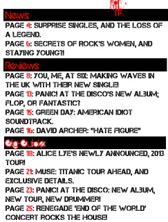
Therefore, a complete list of my contents would be similar to this:
News:
Page 4: Surprise Singles, and the loss of a legend.
Page 6: Secrets of Rock's Women, and staying young?!
Reviews:
Page 8: You, Me, At Six: Making Waves in the UK with their new single!
Page 13: Panic! At the Disco's new album; Flop, or Fantastic?
Page 15: Green Day: American Idiot soundtrack.
Page 16: Foo Fighters: Still got it!
Gig-Guide:
Page 18: Alice Lye's newly announced, 2013 tour!
Page 21: Muse: Titanic tour ahead, and exclusive details.
Page 23: Panic! At the Disco: New Album, New Tour, New drummer!
Page 25: Renegade 'End of the world' concert rocks the house!
Features:
Page 31: Alice Lye tells us all in a dusty room, in an exclusive interview with the musical magician!
Page 33: David Archer talks about stardom.
Page 36: The Joy Formidable: How hard is to to work with Britain's biggest rock group?
Page 39: Has Green Day had its day?
Posters:
Page 41: Muse Poster
Page 43: Killers poster
Page 44: Kings of Leon poster.
Albums:
Page 46: Kings of Leon: Love and Loss.
Page 48: Mr Bright-side B
Page 52: You, Me, at Six: Next months album
Page 54: "We'll be there in a week!" Haim's new album, exclusive to Renegade!
Live:
Page 56: Kings of Leon tear up the 02
Page 57: Kiss: "Still pretty good after all this time!"
Page 59: Haim: The American Lads show us a good time.
Page 62: Palma Violets: Getting back to their home town.
Rockers Quiz:
Page 64: We quiz Coldplay's Chris Martin over his past exploits.
Front cover second draft.
From the feedback given to me, I now have a good idea of what needs to be changed. Firstly, I shall edit the Fonts on my cover, so that there is less confusion over the sizing of the fonts/coverlines.


Next, I need to make my photograph blend in slightly better with my background. To do this, I shall utilize the eraser tool, but change the opacity, and the hardness of the line.
Next, I need to alter the colour of my background colour to something lighter. Firstly, I tried a lighter grey colour, however, that turned out to look too dark yet again, so I added lighting effects, to which the result was far more to my liking. I had to apply the effect several times, but the background now looks far better than a plain black one. This change also allows me to keep my red colour scheme.
Following this, I need to add more design elements to make my magazine more unique, and less generic. I have decided to make this part of my title, as the title should stay the same from magazine to magazine. I have changed one letter of the font, which now makes the title look a little like wet paint, and is now dripping.
Monday, 7 January 2013
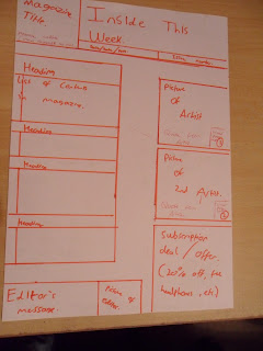
Contents page Flat-plan
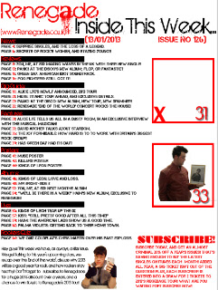
Here is the Flat-plan for my contents page, which features the location of my title, the layout of the pictures for my contents page, an editor's message, promotions for subscription and the other parts that comprise to make a contents page. I also intend to have all my headings in a bolded font, which has the first letter of each in the font I utilized for the title, and a more simplistic font on the other titles. Below the magazine title, I also intend to add a website for my magazine, which will quite simply be www.renegade.co.uk.

Friday, 4 January 2013
Contents page analysis 2

- According to the contents page, there are 58 pages in this issue of NME.
- There are 10 pages of advertising in this issue of NME.
- The type of products that are being advertised could be categorized as: Magazine promotion, Technology, Gig information and clothes.
- The topics in this issue of NME include: Upfront, an interview, new bands special, reviews, ticket booking information, a Gig guide, and puzzles.

- The most number of pages are dedicated to the New bands special, which takes up 22 pages of the magazines 58.
- There are 11 double page spreads inside this issue of NME.
- There is an advatorial on page 7, as it appears to be an article about 'the most WTF musical moment of 2012", they also appear to be advertising the track featured in the section above, making it unclear if it is an advert, or an article.
- The house style is a mixture of a white back background, with large red text to denote the page numbers, and black text for the rest of the page. The quotes from the artists are also in vastly different to each other, insinuating the artist's individual style.
- The focus of the contents page is on the main quote from the lead singer of the band "Pulp", and the photograph to accompany it.

- There is a large red advertisement in the bottom right hand corner of the page, encouraging people to subscribe.
- The header of the issue simply states "Inside this week", giving a title to the contents page.

- The mode of address is much more formal than a magazine such as Kerrang! and makes more use of standard English rather than colloquialisms, except for in the quotes, which come from articles in the magazine.
- The typeface of the contents page is very similar to the front cover, utilizing one main, sans serif font throughout, and with different fonts for each artist's quote to introduce them.
Wednesday, 2 January 2013
Contents Page analysis


- There are 63 pages in the issue of Kerrang! according to the contents page.
- There are 14 pages of Kerrang! devoted to advertising.
- The types of products advertised could be categorized as: Phone advertising, Gig adverting, Album advertising, Clothes and Mental health issues.
- The topics in the magazine include: Feedback, News, Live reviews, Posters, Features, Albums, A Gig guide and The Ultimate Rockstar test.
- The most number of pages are dedicated to the feature of the magazine, which takes up 16 pages of the 63 in the magazine.
- There are 4 double page spreads in this issue of Kerrang!
- There is an advatorial on pages 6 and 7, where the article has been written about the Kerrang! 2013 tour, but it has a Q and A section running throughout, like an interview.
- The house style which can be found on the contents page features Black/Red blocking, Yellow or white text over the top, and Black text everywhere else. There is also a similar red and black colour scheme for the advertisement at the side of the page.
- There is an editorial message at the bottom of the page, which takes up a small section on the bottom of the page, along with a picture of the editor.
- The majority of the contents page is taken up with a picture advertising a competition for a meet and greet with 'Asking Alexandria".
- The header denotes the issue number, and the date the magazine was released.
- The Mode of address matches that seen on the cover, utilizing words which the target audience would also make use of.
- The typeface is similar to that of the front cover, including worn, graffiti like fonts, and bold, sans-serif fonts for the rest of the text.


Subscribe to:
Comments (Atom)