Friday 22 February 2013

Evaluation Question 7

Looking back at your preliminary task (the school magazine task), what do you feel you have learnt in the progression of it to full product?


Above are my preliminary task, and my music magazine. The preliminary task, which is the school magazine featured above was my first attempt at using photoshop, and so I have had to learn how to change my photographs incredibly quickly. However, despite this, I like how this turned out, as it was considerably better than I first envisioned it.


Evaluation Question 6

What have you learnt about technologies from the process of constructing this product?

Through my work, I have learnt a great deal about technology. Mainly, I have used a Mac, with programs such as Photoshop and Indesign. I used Photoshop to edit my photographs, create my cover and contents page and create my design feature, whereas I used Indesign to create my double page spread. Aside from these, I have used many different online sources, as can be seen in the timeline below. These consist of:

  • Sliderocket
  • Animoto
  • Youtube
  • Bubbl.us
  • Prezi
  • Glogster
  • Vuvox
From working with these, I have learnt that Most webpages do not carry on working after a period of time, without signing back into the website(VuVox, Youtube), that animations, videos and audio take up far more space than pictures online(Prezi, Glogster), and that the more information placed onto a single webpage, the longer it takes to load(Prezi,Glogster,Bubbl.us). 


Evaluation Question 5

How did you attract/ address your audience?

Due to the nature of my magazine, my audience would be similar to that of Kerrang!, NME and Rock Sound. Due to my magazine being based off of these, it is clear to see where the elements of my magazine have come from.


Evaluation question 4

Who would be the audience for your media product?

The target audience for my magazine would be drastically different to a magazine such as Kerrang!, due to my magazine being aimed at alternative rock fans, who do not have a magazine specifically dedicated to their wants, or interests. Therefore, my target audience would almost be the binary opposite of a magazine like Kerrang!, or BBC Music. Research using websites such as UKtribes has indicated to me that my target audience tend to have the following traits:

  • High internet use, and magazine use.
  • A fairly high use of television, and of the radio.
  • A fairly low use of newspapers and the cinema.
  • They also use social networking sites higher than most other youth groups.

Due to their varying tastes in music, media and magazines, I have tailored my work to their interests, and their wants.

Here is a member of my target audience called Matt. Matt is likely to buy my magazine as when quizzed about what magazines he purchases, and what his media usage is like, he responded with the following:

  • He buys magazines such as Kerrang! and NME, which are the basis for my magazine.
  • He uses the internet copious amounts, mainly websites like Facebook and Youtube. 
  • His favorite clothes shops include H and M and DC shoes.
  • His favorite shop for film and electronic entertainment is HMV.
  • He spends a large amount of his free time at the cinema with friends, and playing video games on his Xbox 360.


Evaluation question 3

What kind of Media institution might distribute your media product and why?


The way in which magazines are distributed is key to a magazines success. If a magazine is poorly advertised, and poorly distributed, then it will be a complete and utter failure, with the magazine failing to make enough money to break even. Therefore, care has to be taken if this is to be avoided, and if the magazine is to thrive, then distribution has to be taken into consideration. For example, the magazine Kerrang!, which is published by the Bauer Media Group is distributed across the U.K, every week. Kerrang! is considered to be one of the most
popular music magazines in the U.K today, and this is partially down to its distribution. If Kerrang! had not been so widely distributed across the U.K, then it's success would have been far less, and therefore it would have far lower weekly sales.


(Flowchart created with Gliffy.com)


Evaluation Question 2

How does your Media product represent particular social groups?


Here is a comparison of my cover against that of an issue of NME. As can be seen, much like the main image from NME, my artist takes up the vast majority of the page, and is located in the center of the page, which is a convention of all modern music magazines. Additionally, both artists are wearing unusual clothes, which can be used to identify them; in the case of my artist a suit jacket, a top hat, and a mixture of black and red nails and clothing.


Evaluation question 1

In what ways does your Media product use, develop or challenge forms and conventions of real media products?


The title of my preliminary task is Wilmington Weekly. I named it like this as most school magazines are called 'weekly', and due to this being a magazine for Wilmington, I used alliteration to make the title have more of an impact. 
The title logo is a mix of blue and yellow badge, which came from the school crest located on the contents page. 
The main image of the magazine cover is of Archie, and I chose this as he is a student from the school, and in the photograph represents the ethos of the school I wished to portray in my magazine. His body language is also open, making the photograph appear friendly, and making him look relaxed. This would reach out to the readers  of the magazine, as they can see what a friendly place the school is. The content that is promoted on the cover are the key stories from the magazine, thus highlighting their importance. 
The fonts are all very plain, as they are trying to get a message across, rather than create a certain feel, like those in my main task.
The language on the cover is designed to speak to the reader, and encourage them to read the magazine. Since it is aimed at school children, it is also written in a friendly way.
The cover looks very similar to other school magazines, as they often do not have designers for their magazines.                      


The title of my magazine was inspired by Kerrang! as the word on thew surface seems to have nothing to do with music, and yet, like Renegade, can be equated to part of the music industry; in the case of Renegade, my magazine's fans can be seen as outsiders. The images are also heavily inspired by Kerrang! and NME, as they feature artists in gimmicky, and unusual costumes/outfits, which often reflect their character, which is something I noticed NME did more than Kerrang!

The artist on the cover is often the focus of the magazine, and I decided to use my model, as I felt that they would be the best representation of my genre of music, as anyone could be an Alternative rock-star. The font and colouring used are far more aggressive, and dark as these reflect the mood of my music genre, and are far more fitting than warm colours, such as green or yellow. The typeface is also drastically different, as this is far more informal, as music magazines use more direct speech, and profanities. 

The genre of my music is suggested by my magazine, by the model on the front cover, along with her outfit. The font, and colour of the text/background are also indicative of Alternative rock. The front page is more heavily NME inspired than Kerrang!, as Kerrang! has a very messy style, which suits a hard rock music magazine more than mine. The contents page is also heavily inspired by NME, with few columns, and a more spacious design. The double page spread meanwhile is heavily inspired by Kerrang! one artist portrayed in their work is almost exactly like mine, so it allowed me to look at design features too, as well as keeping the multiple column, and single large picture of the artist, which I included in my design.


Improvements to existing final pieces

Now that I approaching the end of my construction, I asked a few other students what they thought of my work, when all three were added together. I also asked for their opinions on what could be improved, or what needed to made better to ensure I can get the highest grade possible.

The first person told me that I should use a larger double page spread picture. I do agree with this statement, as I have a large amount of space which needs to be filled somehow. Additionally, I have noted that my design element in the form of a playing card is roughly the same size as my picture, and whilst I do want that to dominate the top right hand corner, I need to make sure it doesn't appear to dominate my main image.

The second person made several points. Firstly, I have gaps around the pictures on the contents page, which need to be made smaller, or less obvious. The next comment was some praise, stating that I had maintained a strong house style throughout. The last comment correctly stated that I have yet to give an overall title to my double page spread, and so this is something that must be added to my work.

The third person made comments regarding the positioning of the cover lines. I not only need to do this, but also change the size of my primary cover line, as it needs to dominate the cover. Once again, I have been given a small amount of praise for my house style, which obviously doesn't require much work. The final comment made by this person is that the font on the double page spread makes the article hard to read, but also is a font which suits the genre of magazine and music. I am a little unsure what to do about this, as the student would have been reading my work of a screen which makes it incredibly small, so I am unsure if it should be changed or not.

The final person has reinforced the ideas spoken about my double page spread, and the size of the image. As I have previously stated, I shall do my upmost to change this so that it is a much more preferable size. Furthermore, I have been told that the way my text differs is good, so this doesn't need to be changed. The final comment made about my work is that the price of my work should be made the same size as my other texts, so that a more professional look is created. I shall be sure that I do this, as I need to make it as realistic as possible with the tools I have.


Wednesday 13 February 2013

Double page spread design feature


For my double page spread I wish to create a design feature based around the suits in a deck of cards, and the queen of hearts card. Firstly, I had to take photographs of each of the cards I wished to use on my double page spread. I did this by sticking playing cards to a plain surface, which could be easily removed on Photoshop.


Monday 11 February 2013

Double Page spread flat plan


Brand Identity


The final thing that I shall be looking into before designing my magazine double page spread is to look at how Brand Identity is kept from the front page, to the double page spread. This issue of Kerrang! speaks of this band in the contents page, yet doesn't make a huge deal out of them till they are actually featured. On this page, it is clear to see which magazine it came from. The Interviewer is referred to as K!, and there are several instances on the page where the title of the magazine can be seen, such as in the bottom right hand corner. Much like this magazine, I intend to make the link between my magazine pages clear, and despite the fact that my artist is featured on the cover, I can't see any reason as to why this almost simplistic look couldn't work for my magazine too.


 Here is an issue of NME, which has also very heavily inspired my work. This one features a much more stylish double page spread, and whilst I am basing mine more off the Kerrang! double page spread, I wish to establish brand identity like this issue of NME. It is clear that the artist on the cover is the same as in the double page spread, however, I would say they don't feature on the contents page as much, and additionally, there is a less obvious link between the magazine and the feature. I shall avoid this, by ensuring that my magazine title is clearly visible  like the issue of Kerrang!


Thursday 7 February 2013

Additional features


Whilst designing my double page spread, I have to make use of conventions such as Drop Caps and Pull quotes, along with the correct typeface for the magazine.

The first Drop Cap comes from an Issue of Rock Sound. The cap is around 7 lines down, and takes up a very small section of the page. This is down to the size of the text, and the spacing of the text by the picture. The pull quote for this particular article is located under the text, and in the middle of the article. From this, I have learnt that my pull quote doesn't have to come either at the end of the article, or at the start. Furthermore, I may also choose to make my Drop cap more than 2 lines large, which how I originally planed to lay it out. 


The next magazine was another issue of Rock Sound. What made this article stand out for me was the fact that it doesn't feature a Drop Cap at all. It does, however, feature a Pull Quote, which is located at the bottom of the article, which from my research, is a common feature in the layout of double page spread articles. However, I personally like this, as it doesn't break the flow of the article, and makes it seem like a single sentence.

The next article was from an issue of Q. This one features a Drop Cap which covers 7 lines, much like the first Drop Cap, and yet, it appears to be much bigger than the one from Rock Sound. This is to do with the typeface used, along with the colour of the text. The Pull quote is also surrounded with a picture, and red bars to help accentuate its location on the page. I really like this design, as the picture looks as though it is looking back over the quote. I will try to implement this into my work, as I really like this effect.


This Drop Cap is from an issue of Q, and rather than being 7 lines down like the others I have looked at, it is only 5. I personally feel this is a far better size for a Drop Cap to be. I also prefer the style of font used for this rather than the sans-serif font used on the others. The Pull quote is located at the end of the picture, and at the end of the article. As previously mentioned, as much as I think this is too generic, it features in a great number of magazines, though I wish to place my Pull Quote in the center of my article.

Double page spread Design features/ Brand Identity

Along with my pull quote and my article, I also have to look at design features for my double page spread to go along with the rest of my work.  Firstly, I will have to look at other elements from other magazines. I shall also be looking at the ways in which brand identity is kept across a double page spread.


Thursday 31 January 2013

Final contents page


Double page spread layout research

The next step in creating my music magazine is my double page spread. Firstly, since I have already written my article, I shall focus solely on the layout of the article, and how other magazines choose to lay their pictures out.


The first Double page spread is from an Issue of Kerrang! This double page spread features a picture on one page, whilst the other is where the article is printed on the other. The text is all on one page, except there is a column of information on the side of the picture. The text inside the article varies in size, especially where the paragraphs start and end. The pull quote is also located at the very end of the article, and is enlarged. In my opinion I like this layout, as it looks simplistic, and, whilst I feel it could be improved with text wrapping, and a few more design features, I like its simplistic look, and will more than likely include some elements of this in my work.

The second double page spread is from a Rock Sound magazine. This one features the article on one page, whilst the main image is on the other.However, the article is surrounded by smaller images, which I feel is a nice touch. There is a design feature in the form of the arrows, however, I don't feel I shall be using a feature like this, as it wouldn't suit the artist in my magazine.Furthermore, I shall move the pull quote to the start of the article, as I feel this is the best place to put it.

The third magazine is from Q. This one features the photograph being on the opposite page to the other articles I have looked at. However, this one has some text going across the photograph,and the article is a solid block of text. The pull quote appears over the image, and I like the way the questions from the interviewer are written in Red, and the responses in Black.

The fourth magazine is from NME, an like the first two has the photograph on the left hand page. Much like the second image, there is more than one image on the page. The main image also goes across both pages, which, whilst I like, isn't something I shall use in my work. I will also wrap the text, which isn't a feature seen in this magazine.

Improvements to contents page

Once I looked over the first draft for my contents page, I have noticed that a number of changes need to be made. Firstly, I need to alter the way in which my contents page is laid out, as it appears to be in two columns, rather than the three that would normally be found in a contents page. Aside from this, my actual contents are all of different lengths, which, means they don't follow a grid, which most, if not all other magazines follow as well.

Firstly, I shall tackle the problem of the contents length. To do this, I shall change the font, and the positioning of the text. Firstly, I shall split the text into multiple lists, rather than just one. I shall also move the text around in such a way that it follows the conventions of other magazines, such as having more than 2 columns.

I have also added a further advertisement to my subscription offer, but this may need to be changed if I update my cover. Additionally, I have also made sure that my columns are also the same length and width so they are the same. Furthermore, I have also wrapped the text around the subscription photograph, as it creates a more unified shape. This was done by overlapping two rectangles. One was set to normal, and the other was set to cutaway.


-Normal
-Cutaway


Furthermore, I will also have to add a photograph of my double page spread onto my contents page when it is finished.


However, after being given further feedback, the contents page doesn't appear finished. I shall re-align my contents into a grid, and also find a far better way of showing my columns. I shall also add a page number to the bottom of the page, to help create a feeling that this is an actual contents page.

First, I added a block backing to my Contents sub titles, along with a red block to separate my second and third columns, as there wasn't enough space between them. I also made sure that the title went across the top of the box, as it is supposed to be in front of the rest of the article.


I also went on to add a page number to the bottom of my page in the bottom right hand corner, as if I'm putting this on my double page spread, I feel I should have one on my contents page.


I also added a page curl effect just above the place where my double page spread will go, as it is a rather interesting feature, and my contents page was missing some design features.


Friday 25 January 2013

First draft of Contents page

Here is my initial draft of my contents page. I am happy with the result, even if I will have to wait for my double page spread to be finished before I can be fully finished with this piece of work:


Thursday 24 January 2013

Contents page construction

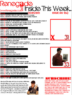
Now that I have completed my research, I can begin to construct my contents page, or rather the first draft of it. Firstly, I have to place my magazine logo in the top, left hand corner of the page, as matched by my plan.


Once I have done this, I also had to add the website just below this. I used the same font, and along with this, I intend to make is small enough to fit next to the dripping part of the letter 'a'.


The next step was to add the 'Inside this week', which is inspired by my research of NME. This would go next to Renegade, and form the right hand corner of my page.


Next, I decided to write my editor's message. This was heavily inspired by the work I had seen in Kerrang!, and is a feature that I feel more magazines should make use of.

After I had written this, I decided that I should change my background colour to match my research, rather than focus on the same colour. I made the entire background white, similar to the issue of Kerrang! I looked into.


To accompany my Editor's message, I have added a subscription offer onto my contents page, as this a prominent feature of other magazines, and I feel it suits my contents page. I also made the heading of 'Subscribe' larger than the rest of the text to make it more prominent.


Whilst I like the red colour scheme which I have taken across from the cover, I feel that I need to change the colours of some of my text, and so I changed some of my work to black text, rather than red. I also added a date and issue number just below the 'Inside this issue' section at the top of the page.


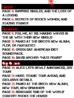
The next step was to add my actual contents to my contents page. This was copied across from an earlier post, where I listed what I would include in my magazine.


However, I didn't like the way the text all appeared to be the same, so I added some blocking behind the headings to make them more prominent.

However, these, I feel, were far too short, and so I made them longer, and of a matching length to make sure my magazine looked more professional.


The next step for me was to add my pictures. Since I intend for one of my photographs to be a preview of my contents page, that has to be done before I can take the photograph, so for now, I shall have to add a cross to the box where it would go, along with the page number for the respective page in the magazine, and address this later on.


Next, I have to add the picture of my second artist to the box below this. Then, once I have added my editor's photo, I am finished.


Now, here is my first draft of my contents page, without my double page spread picture: